Sunday, May 27, 2012

Week 1 - "Patria est, ubicumque est bene"

“Home is where you feel comfortable”… Well if Cicero is right with that quote then I can definitely consider Rome as home… It is now the third time that I am in this beautiful city, but this time it was a little different: the last times I just came here as a tourist, didn’t stay longer than a week or so. The city appeared to me intimidating with all his history and all his sights, I didn’t really know where to get start. This time I came prepared and not as a tourist; this time I actually become a citizen of this beautiful city. (At least I will try my best to do so) The first week was kind of busy, we had classes every day, and I already feel like we already learned so much, although we probably barely scratched the surface…, especially since it is probably impossible to define what Rome is, but exactly that is what makes it such an incredible place to study. I can already feel my improvement in sketching and in Italian. In sketching we had some hard sketching sessions, hard because we’re in Rome and there are a million vanishing points in every perspective. But you grow with every challenge right? And so I already did I think. Last Friday we sketched Piazza di Spagna (the "Spanish Steps) it's a very challenging subject, I picked a spot on the steps and sketched for half an hour. The result of that sketching session is this perspective, a little traffic analysis and a pretty bad sunburn on my neck…

Today all of us went to the Pantheon for Pentecost (some of us got up earlier some later...) but all of us made it to the mass and the rose petals raining from the oculus. It was an incredible experience, it was a grotesque atmosphere toward the end of the mass, more and more people entered the Pantheon and it got very crowded, suddenly thousands of cameras and iPhones were wondering around, and this was still DURING there was a mass going on. Every once in a while a Italian security said “no camera! NO CAMERA!!” but there were just to many and there were just over-challenged… But it was definitely as I said earlier an amazing experience, definitely worth getting up and not sleeping in.
Of course just like everyone else that I just complained about also I took some pictures, but this picture not even close does justice to the beauty of that event.


Tuesday, May 15, 2012

Boise Fire Station #5: 2012 ICMA Competition [presentation board]

SPEED is a main factor in this the main factor in this design. The fire station glorifies the horizontal forces, the panoramic mountains, the nearby highway, the speed of the fire trucks and the Concrete Masonry Units. The apparatus bay is the heart of the fire station and with the tilted arrangement it is present from every angle of the building (except the dorm rooms).
Just one custom cut CMU block is needed. With clever rotating that one custom block is enough to build every occurring corner in the building.


Boise Fire Station #5: 2012 ICMA Competition [drawings]

main perspective


exploded Axonometric with floor plan


facade close up

wall corner detail


interior perspective


connection detail


exterior perspective


section perspective


Monday, May 14, 2012

Long Span Structure [presentation board]


The tennis facility “Top Spin” is designed for people to not just play tennis, it’s a place to meet, watch, hang out and socialize, its designed for tennis, its designed for tennis to be not just a sport, but a lifestyle.

The layout is arranged so that the clubhouse with the lounge, pro shop and lockers form the entrance and once you entered the site you get the overwhelming view over the all the courts.
The outdoor courts are arranged to create spaces between the courts, for people to meet off the court. The courts are dropped down, like an arena, so that the players are not distracted by people wondering around the facility.
The indoor courts are served with a separate locker room on the south-east side of the building (that also serves the PEB building), so the indoor courts become their own facility in the winter.
The indoor courts are covered by a steel structure with kalwall openings that let diffused light in, so that there are no awkward shadows on the courts. The structure continues throughout the east, south and west walls and becomes a glass façade on the north side to let secondary light in and connect the indoor facility with the outdoor facility.

Sunday, May 6, 2012

Portland [co]Housing Project [presentation board]

The sun and views were the main influences for the design. The buildings are arranged to promote maximum exposure to sunlight flooding the apartment with light. The views are simultaneously limited and extended, allowing for privacy and views of the courtyard. A main feature in the design is the black strip that wraps around the buildings, working as a unifying element and defining individual apartments. The circulation is toward the courtyard, connecting apartments and courtyard. The community space is sunk partially into the ground so that there still is connection on the one hand but that it is not too omnipresent on the other. The community area becomes part of the courtyard where there is a visual connection between the courtyard and the space, while apartments radiate around the common space.


Portland [co]Housing Project [drawings]

Courtyard Perspective #1


Courtyard Perspective #2

Street Elevation (Lovejoy Street Portland OR)


North-South Section


West-East Section


Section-Perspective of community-space with green-roof 


1st floor apartments

two story apartments (2nd 3rd floor)


interior perspective (community space)


interior perspective (one-bedroom apartment)


night rendering (street view)

process parti drawings

Saturday, May 5, 2012

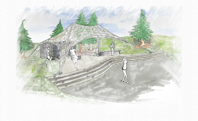
Arboretum Pavilion Final [presentation board]

The pavilion is designed to offer visitors a new way of experience of the Arboretum. The design is organic; it goes with what has already been there. It’s meant to go with the nature and be part of it. It is a design that almost isn’t there.
There are no walls, just a light tent-roof-structure, so if you enter the design your views are not getting limited but framed (-> what allows the new way of experiences). Plus you get a protected feeling of being under a roof. Inside & outside merge. The roof structure is made of Plexiglas so the view is even less limited from the inside; from the outside the surroundings of the pavilion reflect in the Plexiglas, so that it becomes part of the Arboretum. 

Arboretum Pavilion [drawings]


process parti diagrams


Perspective #1


Perspective #02


North Elevation


West Elevation


Final Perspective (hand-rendering + photoshop)


Final Perspective (hand rendering + photoshop)