FilipsSketchBook
Monday, April 18, 2016
Friday, April 8, 2016
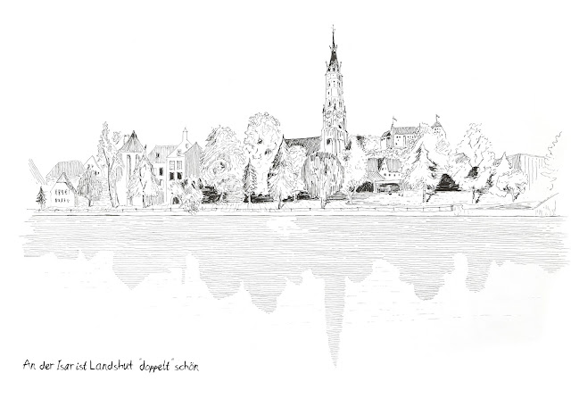
Landshut Impressionen
Hier meine persönlichen Lieblingsmotive aus meiner Schwarz Weiß Serie aus dem 2016 Kalender "Impressionen aus Landshut"
Monday, September 15, 2014
Advanced Analog Graphics
My 'Moscow Family'
Analytiques Perspective -> ParallelDrawing -> Plan
Pantheon Analytique
Gothic Column Analytique
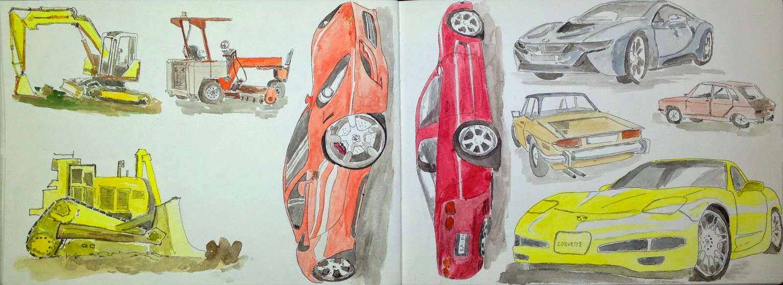
Cars - Vehicles
Cars - Vehicles
Landscapes
Landscapes - Copying techniques
St Martins in Landshut GERMANY
"Himmel Landshut"
San Carlo alle Quattro Fontane - Visual Notes 2
Pantheon & Villa Giulia - Visual Notes 2
Piazza Navona Rome - Visual Notes
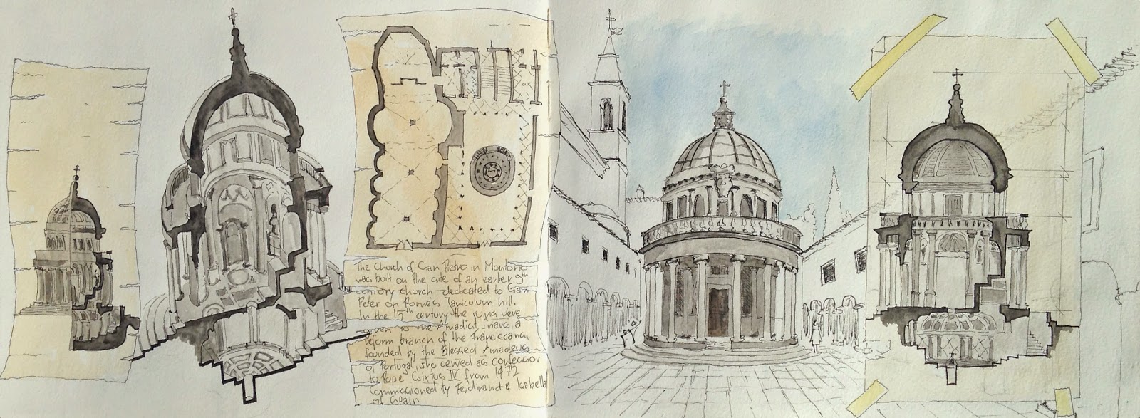
Tempietto Rome - Visual Notes
Architectural Survival Kit - Test Page
Wednesday, April 23, 2014
Friday, April 18, 2014
Friday, January 17, 2014
Project Art Institute of Chicago (AIC) – Make: Pavilion, Chicago, IL
Final Presentation:
The role of museums has changed over time and never more so than in the last 10–15 years. As well as their traditional role of collecting, preserving and sharing rich collections, museums now find that they play an increasing role in supporting the development of communities. Museums can be a place to help shape community identity and bring different community groups together. So from the beginning of the project I tried to make the sculptural garden the main
feature and integrate the building within it. With the long and slim site that was way harder than I thought and everyone I think was struggling with that. So the design tries to merge the garden and the building; and it does so in two ways, first the garden and the building are not just next to each other as two individuals but they wrap around each other, and the second is the outer skin was inspired by sculptures so the building becomes a sculpture itself, so it becomes a part of the sculpture garden.
As already mentioned this outer skin is a main design feature of the building, so let me talk about that a little more:
It actually started out as this thing that just ‘looks cool’, but when thinking about materiality and detailing it actually got an actual purpose. First as already mentioned it is meant to help integrating the building into the site, then it acts as a shading device for some parts of the building. The reason for using coret is that, Chicago literally is a concrete jungle, not many parks or green spaces, so the dramatic copper facade is perforated and textured to replicate the impression made by light filtering through a tree….
When starting the project I wanted to design a straight forward, plain building that doesn’t take away from the art, well that has changed radically on the exterior as I already said earlier, but I kept that design goal for the inside, if you take a look at my interior perspective I dematerialized the interior, so it becomes a heaven like space, without any distraction, almost isolated from the busy city.
Exterior Perspective (approach from north)
Exterior Perspective (approach from the south)
Perspective showing the different layer (outer skin, structure, envelope)
Interior Perspective (main gallery space)
Interior Perspective (exhibition space)
Exterior Perspective (Night Rendering)
3-D Detail + 2-D Detail Drawings
Massing - Process - Diagrams
Floor plans (1st-2nd-3rd)
North-South Section
East-West Section
West Elevation
North Elevation
Subscribe to:
Comments (Atom)


